Data visualization with Pandas
Pandas, a powerful data analysis library in Python, offers built-in capabilities for data visualization. Visualizing data helps in understanding patterns, trends, and relationships within datasets.
We'll be using a dataset containing information about various car models, including their prices, engine capacity (CC), mileage (kmpl), and more.
Plotting with Pandas
Pandas makes it easy to create various types of plots directly from a dataframe. Here's how you can create some common types of plots.
1. Line Plot
A line plot is useful for visualizing data points over a continuous range, such as time or index values.
df.plot(kind='line', x='Name', y='Min Price (Lakh)', title='Minimum Price of Cars')
Output:
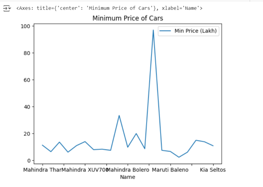
This code creates a line plot showing the minimum price of each car model in the dataset.
2. Bar Plot
Bar plots are best for comparing categorical data, such as the price of different car models.
df.plot(kind='bar', x='Name', y='Max Price (Lakh)', title='Maximum Price of Cars')
Output:
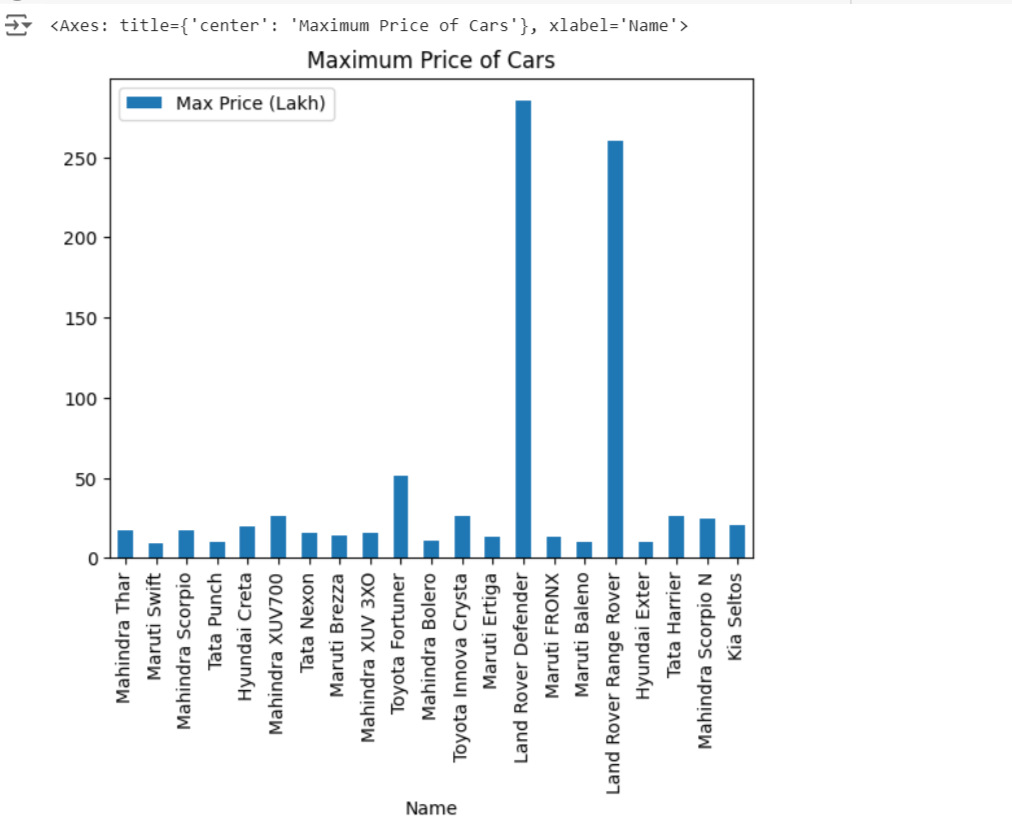
This bar plot compares the maximum price of various car models.
3. Histogram
Histograms are used to display the distribution of a continuous variable.
df['Range (kmpl)'].plot(kind='hist', bins=10, title='Distribution of Mileage (kmpl)')
Output:
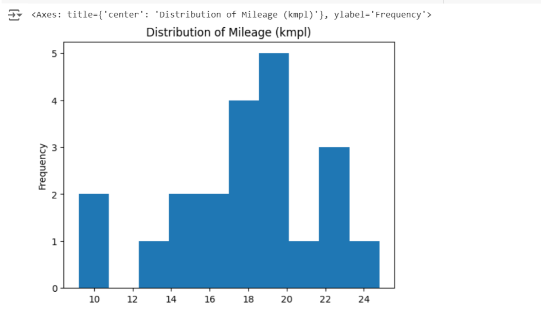
The histogram here shows the distribution of the mileage (kmpl) of the cars in the dataset.
4. Scatter Plot
Scatter plots are useful for identifying relationships between two continuous variables.
df.plot(kind='scatter', x='CC', y='Range (kmpl)', title='Engine Capacity vs Mileage')
Output:
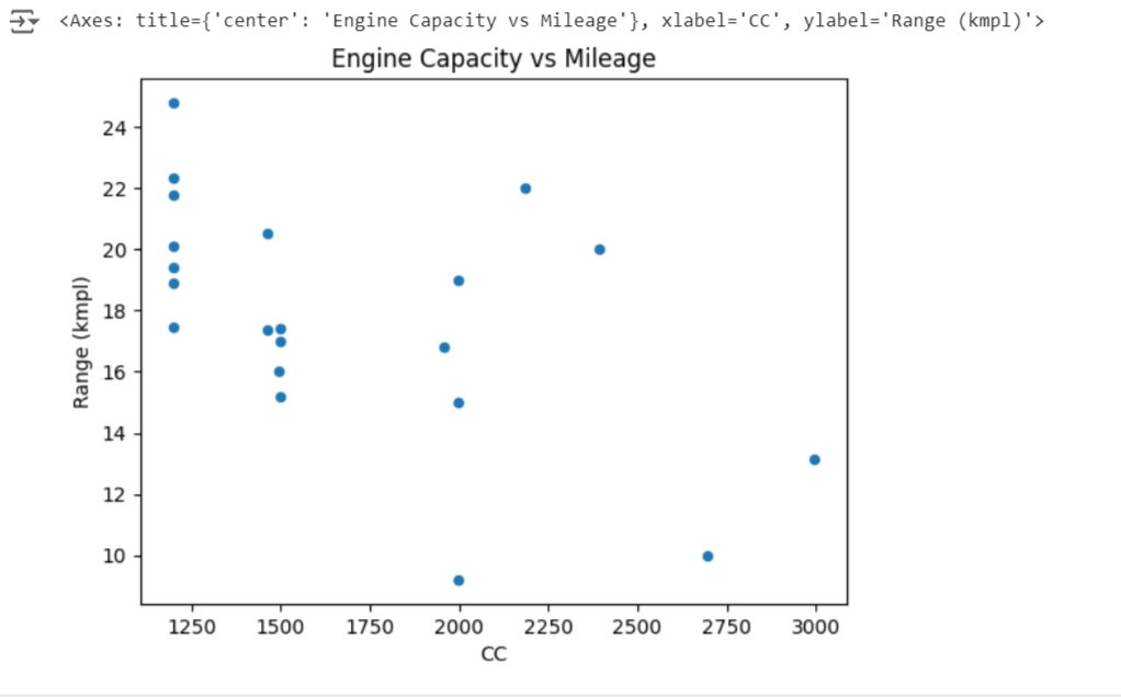
This scatter plot visualizes the relationship between engine capacity (CC) and mileage (kmpl).
Customizing Plots
Customization is key to making plots more informative and aesthetically pleasing. Pandas allows you to easily customize titles, labels, legends, and other elements.
1. Adding Titles, Labels, and Legends
Titles and labels help in understanding what the plot represents.
  ax = df.plot(kind='bar', x='Name', y='Seats', title='Number of Seats in Different Cars')
  ax.set_xlabel('Car Model')
  ax.set_ylabel('Number of Seats')
  ax.legend(['Seats'])
Output:
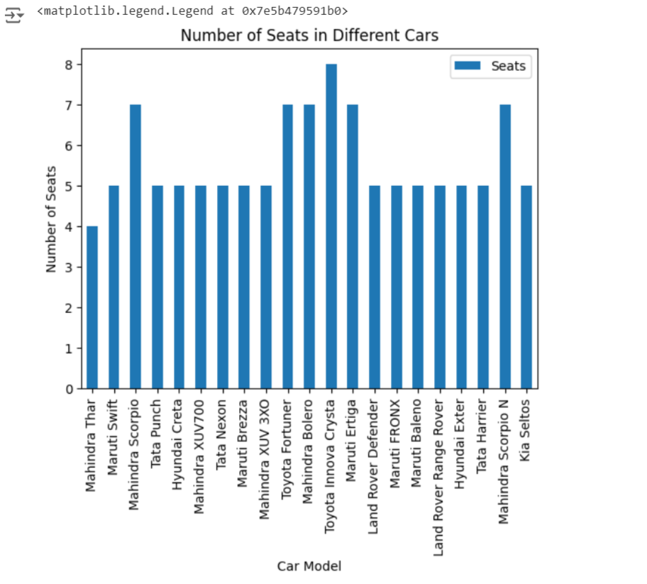
This bar plot shows the number of seats for each car model, with appropriate labels and a legend.
2. Customizing Colors and Styles
You can customize the color and style of the plots to match your preferences or specific requirements.
df.plot(kind='line', x='Name', y='Min Price (Lakh)', color='green', linestyle='--', title='Minimum Price of Cars')
Output:
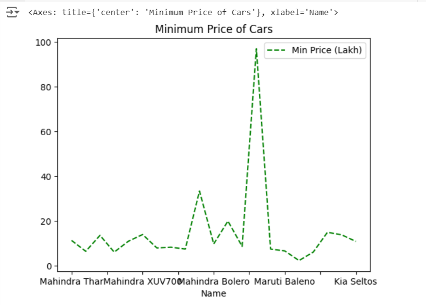
Here, the line plot is customized with a green dashed line.
Integration with Matplotlib and Seaborn
While Pandas provides basic plotting capabilities, for more advanced visualizations, you might want to integrate with Matplotlib or Seaborn.
1. Using Matplotlib
Matplotlib offers a wide range of customization options.
import matplotlib.pyplot as plt

ax = df.plot(kind='scatter', x='CC', y='Range (kmpl)', title='Engine Capacity vs Mileage')
plt.xlabel('Engine Capacity (CC)')
plt.ylabel('Mileage (kmpl)')
plt.grid(True)
plt.show()
Output:
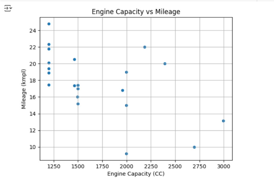
This code integrates Matplotlib for additional customization, such as adding a grid to the scatter plot.
2. Using Seaborn
Seaborn is built on top of Matplotlib and provides a high-level interface for drawing attractive and informative statistical graphics.
import seaborn as sns

sns.set(style="whitegrid")
sns.barplot(x='Name', y='Max Price (Lakh)', data=df)
plt.title('Maximum Price of Cars')
plt.xticks(rotation=90)
plt.show()
Output:
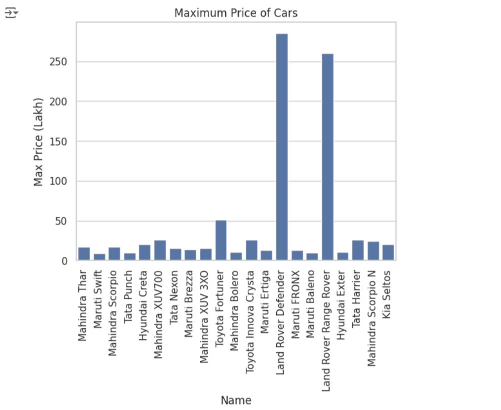
Here, Seaborn is used to create a bar plot with a white grid background, making it easier to read and interpret.